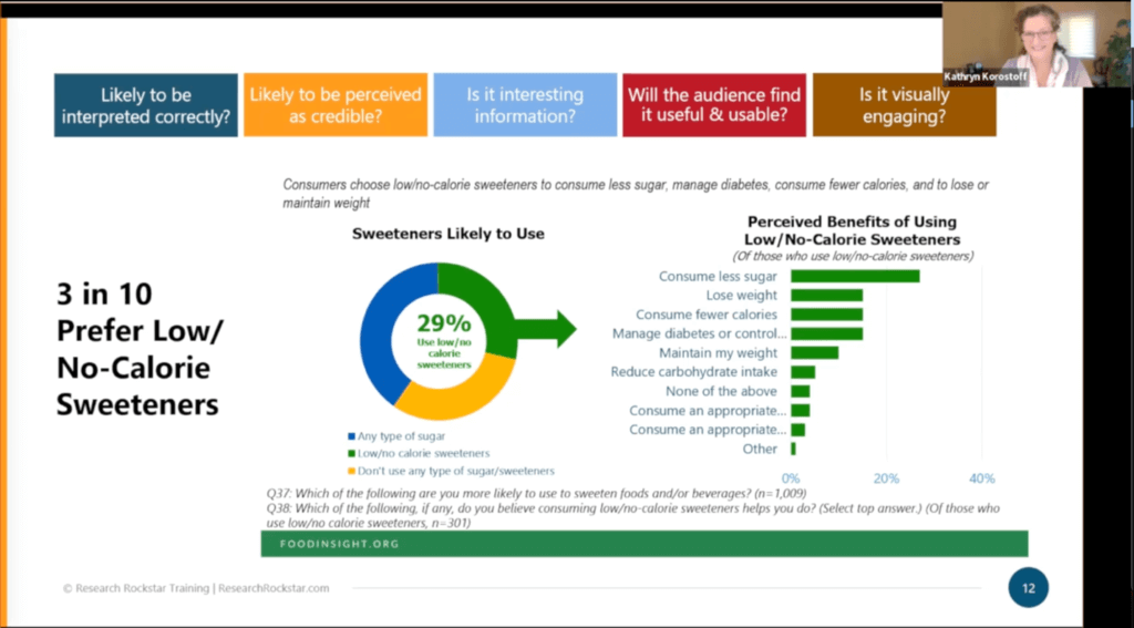
Whether you are a seasoned market researcher or just starting your journey, understanding how to create client-ready data visualizations is crucial for success. Recently, Instructor Kathryn Korostoff outlined the five crucial criteria needed to assess the client readiness of data visualizations in professional-quality market research in this episode of "Conversations for Research Rockstars". Let’s explore each of these criteria in detail.
- Is it likely to be interpreted correctly?
The all-too-familiar reality with market research reports is that clients or stakeholders will sometimes speed through the reports. With speed-reading business audiences, making information easy to understand "at a glance" is critical. Effective data visualizations should be easily understood by our audience, even if they’re speeding through! Attributes such as colors, labels, wording, format, spacing, etc. boost the chance that data will be interpreted correctly (as proven through various research studies and experiements*). - Is it likely to be perceived as credible?
Credibility is paramount in market research; if readers don’t feel the data is believable, they won’t use it. Data visualizations must convey easy-to-interpret findings and project credibility. It can be tricky: there are many potential detractors to perceived credibility, like using a "dated" design (people do judge a book by its cover), irrelevant text on the same slide, or key details being left off. On the other hand, always include the sample size, relevant screening notes, and citing related sources (if applicable) boost credibility. - Is it interesting information?
If your results are interesting, say so! Don’t bury the lead. Add powerful statements that help readers see what is interesting. Instead of "Brand perceptions vary by age range" (boring) how about "Boomers Applaud, Millennials Yawn"? Adding a catchy title boosts engagements and (in this example) also aids comprehension by highlighting the "so what" of the specific chart. - Will the audience find it useful & usable?
A well-designed data visualization should show the reader that the data is useful (can be applied to business decisions) and usable (doesn’t need to be reworked in order to use or share with others). Thinking about these questions before sending in your report saves your client some headaches; many market research clients complain that they have to "re-do" slides or even entire reports before they can share them or repurpose parts for other internal needs. - Is it visually engaging?
Finally, aesthetics matter. Nobody wants to go through 20 pages of seemingly endless, nearly identical bar charts—how boring! While you don’t need to be a graphic designer, your data visualizations should be visually appealing. Use consistent color schemes, fonts, and overall design. Avoid overwhelming your audience with unneccessary visual distractions, but do add elements that amplify the story. For example, if a relevant stock photo or avatar image can amplify a chart’s key point—great!
Market Research Data Visualizations in Action
In this episode of "Conversations for Research Rockstars", Instructor Kathryn also grades a sample data visualization using these five criteria. Skip ahead to 03:49 to see these criteria in action.

So, what do you think? Would some, or all, of these criteria boost your teams use of data visualization and help "wow" your clients and stakeholders? Did our sample critique inspire any ideas for your own research reporting? We hope so!
*There are numerous studies on design choices that boost data visualization comprehension, including Visual Arrangements of Bar Charts Influence Comparisons in Viewer Takeaways and Understanding the Positive Effects of Graphical Risk Information on Comprehension: Measuring Attention Directed to Written, Tabular, and Graphical Risk Information.


