Bored with bar and pie charts? Maybe it’s time to rethink the types of graphics you are using to display key research findings.
One graphic display that makes rare appearances in market research reports is the classic Venn diagram. It’s a wonderfully intuitive way to show overlapping groups.
Attributed to John Venn, the Venn diagram was first introduced in 1880.
I have seen 100s of research reports, and written many myself, that contained statements about overlapping groups, like, “Customers who buy from retail stores and those who buy from our paper catalog increasingly prefer buying from online retailers.” OK, the statement isn’t so complicated. But wouldn’t a Venn diagram have more impact?
If your audience includes people who aren’t necessarily comfortable with lots of statistics, or who just have short attention spans, Venn diagrams are a powerful and simple way to convey overlaps, and trends in such overlaps.
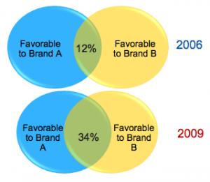
 In this diagram, I show how 2 customer groups increasingly overlap over time.
It could be done as an animation for even more impact.
For more Venn examples in template form, check out this great Slideshare file: Venn.
And for more examples of various visual displays, please download the free eBook “Makreting Research Insights: 22 Visual Displays.
” The ebook is available in the members-access section. Not yet a member? Sign-up for a free membership here: SIGN UP.
[All comments welcome! Every 2 weeks I randomly select a commenter to win a Rockstar Mug: PIC. Next drawing is 11/6!]


