by Debra Mascott, Director of eLearning Curriculum, Research Rockstar LLC
Pie charts have long been a staple way to convey data for market research reports, but are pie charts getting stale? Cutting a pie into slices to display percentages has been the de facto way to convey percentages of a whole. But fresh alternatives exist.
Charts and graphs relay a message
The key ingredients of great market research charts are simplicity (conveys a result simply) and visual interest (gets the reader’s attention). Chart type selection varies by the type of data you wish to communicate:
- Time. When data is conveyed over time, the best chart to use is line, bar or column charts. This helps visualize a trend. It’s easy to see if sales increased from one year to another using a line, bar or column chart.
- Comparisons. When comparing multiple variables, cluster bar charts or column charts help visualize patterns. For example, when comparing pistachio ice cream sales to chocolate cherry chunk by days of the week help to visualize a pattern.
- Parts of a whole. When particular data is highlighted as a part of a whole, pie charts help visualize results.
Choosing the chart that best conveys the result’s message is key. But charts are not always the best choice for your data: when the data is so complex that the message can’t be easily understood in chart format, a simple table is an acceptable alternative.
Donuts, lollipops and pies: choosing chart types
One current trend in visual display is to use a chart type called donuts. Like a donut (or bagel), the chart displays the data with an open hole.
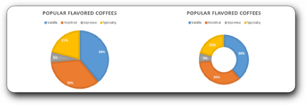
In the hypothetical example above, we have surveyed coffee drinkers about their flavored coffee preferences. The percentages and categories are identical, but the chart format is different. While there is nothing fundamentally wrong with the pie chart on the left, the donut pie chart on the right is visually more balanced. So, which do you find easiest to read? Most visually interesting?
Here is a simple table of pie chart pros and cons.
| Pie Chart Pros | Pie Chart Cons |
| Displays data as a percentage of a whole (or 100%). | Doesn’t allow for trending over time. |
| Visually easy to compare items. | Difficult to distinguish individual slices if they are approximately the same value (quantity). |
| Conventional: comfortable for your readers | Too many slices (more than 5) becomes hard to read. |
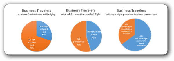
With donuts, the values may be the same, but the visual impact is more dramatic. In this hypothetical example, the donut charts displays three different messages:
The visual depiction of the data is very clear. The important point is that there are three distinct data results telling a story about airline business travelers.
Which version do you find most compelling?
Just to keep this article balanced, there are schools of thought which debunk the donut chart. Andy Kriebel of VizWiz blog fame makes a strong case that “Donut Charts are Worse than Pie Charts.” His examples show the message goes awry when the data isn’t displayed in logical categories.1
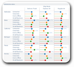
| Lollipop charts are alternatives to bar/column charts When I was a kid my dentist used to give out lollipops for a good check-up. Ironic (or self-serving) since sugar-induced lollipops cause cavities. In our case lollipops can be alternatives to bar and column charts. Andy Kriebel of VizWiz nicely defines lollipop charts, “Lollipop charts are a combination of a bar chart and a dot plot. Lollipop charts are great for giving you a sense of both length (bars) and precision (dots).”2 |
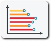 |
Lollipop charts can help display a wide range of data. The benefit is that the length of the bars display the value of the information and the dots display the precise values.
So, if you feel your market research reports are getting stale or your reports are beginning to look alike, then Research Rockstar can help. Research Rockstar has a class on Infographics for Market Researchers. The goal is to introduce students to visual the display of data in unique and engaging ways. Through dozens of examples and user-friendly websites to create infographics, the course shows students what constitutes good infographics and how to use them in market research reports. As well, Research Rockstar offers courses on both Quantitative and Qualitative Report Writing.
Additional Website References related to the visual display of quantitative data:
http://chandoo.org/wp/tag/in-cell-charting/
http://www.highcharts.com/demo/pie-donut/grid-light
http://interworks.co.uk/blog/lollipop-charts/
http://junkcharts.typepad.com/junk_charts/donut_chart/
https://www.google.com/?gws_rd=ssl#q=donut+pie+charts
http://peltiertech.com/chartbusters-reworking-a-new-york-times-box-of-donuts/
http://vizwiz.blogspot.com/2012/06/donut-charts-are-worse-than-pie-charts.html
http://vizwiz.blogspot.com/2012/07/tableau-tip-ill-take-you-to-candy-shop.html
http://vizwiz.blogspot.com/2015/02/lollipop-how-to.html
1 http://vizwiz.blogspot.com/2012/06/donut-charts-are-worse-than-pie-charts.html
2 http://vizwiz.blogspot.com/2012/07/tableau-tip-ill-take-you-to-candy-shop.html


